
There are 2 main parts to the branding on the New CMS. The first deals with branding the New CMS itself and the second deals with how a user adds their own brand. Let's look at the new CMS brand first.
CMS brand
The CMS itself needs a name, logo, colours, etc so it can be recognised. Since we at Huyton Web Services create brands and we are building the CMS, we didn't have to go far for the brand.
You may think the best place to start would be the name of the product/company, but the best start is describing words. These are words that will describe the product/company. In our case we went with:
- Friendly
- Secure
- Local
- Loyal
Notice we did not choose any technical words? The closest word is 'secure'. That is because a Content Management System is not about the technical, it is about removing the technical so the user can simply add content. If we wanted technical, we could just give access to the database tables like a spreadsheet (sometimes that is all the user wants, so we do have an import/export for that).
The Name
Looking at the describing words, "Dogs" seemed the obvious choice, as a dog fits the describing words with being loyal and friendly, while offering security. To emphasise security we thought 2 dogs, each alert and looking in a different direction. This gave the name "Two Dogs". However, Two Dogs could be a vet or pet food so we added "CMS" and that was the name:
Two Dogs CMS
Before we could take the name 100%, we needed the domain, since this is an online CMS. Without the domain, the name was no good. The moment we agreed on the name, we tried to purchase the domain. If we had searched and not purchased, we would have lost the domain to a 3rd party that would charge a "ransom" (we see this often). The domain https://twodogscms.com/ was available, so we purchased it there and then.
Once we had the describing words, name and domain, we needed to look at colours, logo and fonts.
Colours
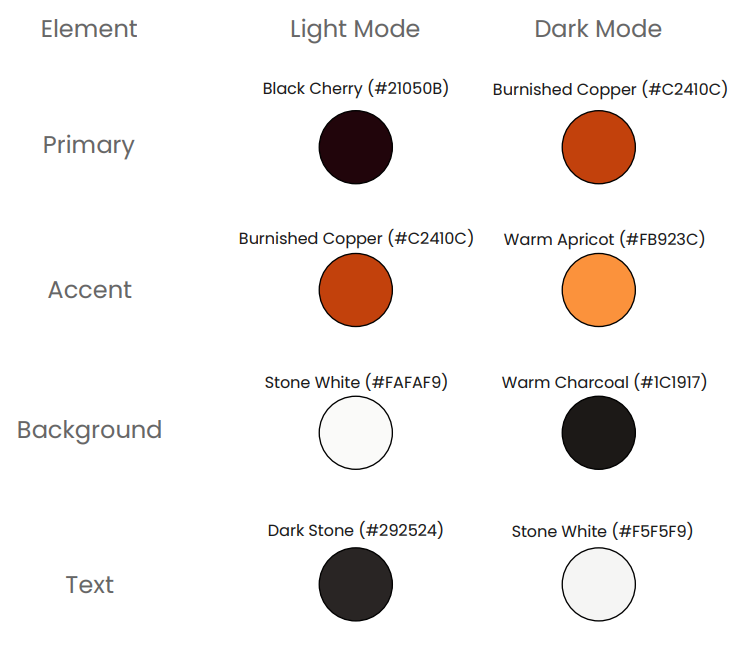
We wanted to have colours that have and editorial feel, along with the other describing words as a CMS is about content creation, wordsmiths and editors, so we added 'editorial' as a 5th word. With this in mind, and after looking at a multitude of colours, we chose Rich Burgundy & Burnished Copper with the core message protecting "precious content," this palette treats content like a valuable archive or high-end publishing house. The colours we went with are:
Logo
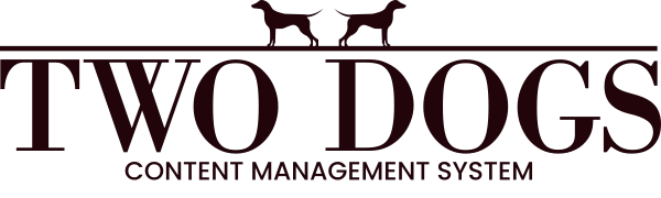
We tried a few different logos and icons, but the two dogs, alert and facing each direction worked well. We also wanted to convey editorial while keeping it friendly. To do this we found a mix of 2 font types, serif and sans-serif worked in this case (usually we wouldn't do this).
After much trial and error we landed on:
Fonts
We wanted to use fonts we could use in all spaces without paying for extremely expensive and prohibitive licences, so we used the open-sauce Google Fonts. We started with a main body font, which must be friendly and easy to read. We went for Poppins for this. We also wanted to get a little "editorial" for the secondary font, to be used for titles and maybe even the first letter on pages. For that we went for Libre Bodoni.
CMS Brand Summary
We had all the parts to our new brand. We tested this and created a few colours to the logos and even added a few extra logo parts. Once this was all agreed, we created a branding guidelines doc:
User Brand
We had our brand for Two Dogs CMS, now we needed to add the ability for the user to add their brand to the system and the system to use that brand.
Since file storage was in, we could give the ability to upload the logo, small logo and favicon. The system supports dark and light modes, so we had to give the ability for the user to upload logos for both modes and the favicon, so 5 files. We also know the brand would not change as the user changed themes, so the Theme section was not the place for brand options. The brand would also need colours and fonts, so there is a lot to the brand.
Brand or Settings section
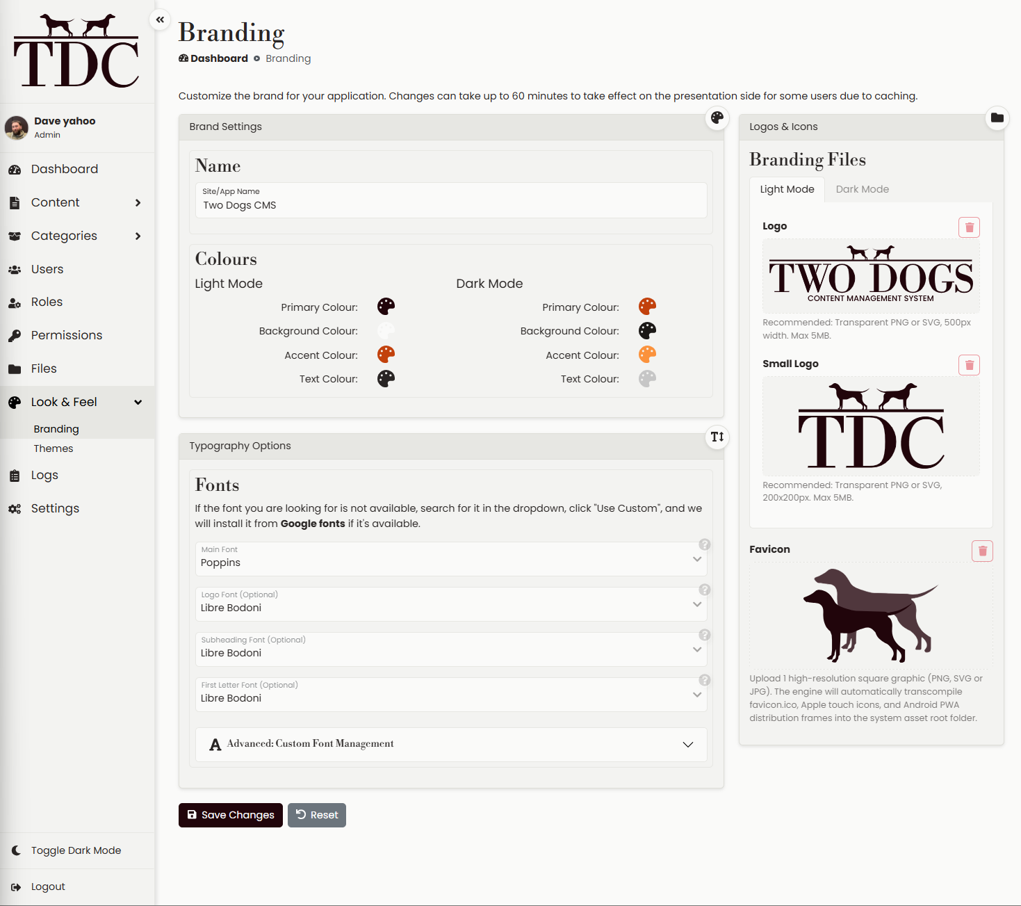
We had 2 options here, add brand options to the Settings section and make that section much larger or create a new section for the Brand. A new section was the obvious choice. We created a new group to the menu called 'Look & Feel' and added Theme and Brand then created the Brand options page.
We now had to fill in our new Brand section.
Colours & Name
We started by moving the site/app name from settings, as this is really a brand option more than the settings or theme. Next we had the colours, we needed to give options for:
- Primary
- Background
- Accent
- Text
We added colour pickers for each of these, with RGB, hex, HSL, CYMK, colour guides and all manner of useful design options and we did this for Dark and Light modes for each option.
Fonts
Next we added fonts. We added 8 basic fonts to choose from for the options:
- Main - Used in the body, menus and the default
- Logo - If no logo is uploaded, this font can be used with the name to create a logo of sorts
- Subheading - Used for any titles on page
- First letter - This will change the first letter on any content page to this font, make it double size and align top
We also gave the ability to upload fonts as some users will want to upload their own. These uploaded fonts are then added to the 8 basic fonts list so uploaded fonts can be searched and to be used just like the basic fonts. This was a little confusing, so we grouped the uploaded and basic into there own groups in the dropdowns.
Lastly, we give the ability to search for a font in each dropdown, but if the font is not found, we have give the ability to click to install from Google Fonts. For example, if we search for "Libre Bodoni", that font does not exist, but we can click install and use if from Google fonts.
All together, this gives the fonts options huge scope for anything the user needs.
Files
The last section is the files section, this is where we allow a user to upload:
- Logo - Used on the dashboard, the top left of the admin and the main logo on the presentation side.
- Small logo - Will override the logo on the top left if added.
- Favicon - Used for the favicon for the Admin and Presentation sides.
We added tabs for Light and Dark modes for the two logos.
If a user uploads 1 logo, it will be used for everything that needs a logo, if they upload a small logo, this will override small logo placement, then the dark logo will override the main logo, then small dark version. By doing this, we know the system will always have a logo.
This rounded off the Brand section.
Adding the brand
We wanted the user to be able to see the changes in real time, so if they add a logo, it should appear in place. However, we also wanted the user to be able to 'backout'. We could have added 'versions' and 'rollback', but that means waiting for the save, then rolling back and potential cache issues when a user gets the brand that needs rolling back for a time.
Instead, we decided to use real-time updates. If the user changes the background colour, they will see the change in real-time, same for all colours, fonts and logos, but if they want the changes to 'stick' they need to save and everyone will see the new brand. If there is a mistake, they just refresh or move to another page and get all the 'old' options back.
For UX we may look at messages to help the user when changing page or refreshing, like "You've made changes, but not saved. Are you sure..." and a button to reload old options.
And that was it for the branding.
If you'd like us to have a look at your branding and create branding guidelines, please contact us. If you're interested in the CMS or having any webapps created for you, please let us know.