
Over the years I’ve used many frontend libraries, UI libraries, toolkits, etc. Some great, some not so great. For a while now I’ve used Bootstrap and it’s perfect for most cases. I build a layout, create a design and Bootstrap allows me to do exactly what I need, then gets out of the way when I don’t need it. There is a huge library of usable components, there isn’t a massive amount of extra, useless classes and the code is separated and clean. Lovely.
Lately, I’ve been using more and more React and where Bootstrap works well with React, it only allows me to bring in the full Bootstrap or nothing, no imports for only what I use (there is a React Bootstrap we can look at later). This isn’t great for bundle size and performance so I’m looking to find something that is.
I’ve found a bunch of UI libraries and I’m going to test each one with the following test:
- Responsive
- Background colour: Black → Blue (#0C004E) → White
- Front colour: White
- Font colour: black
- Font as Fredoka from Google fonts
- Main menu with responsive version
The design will looks something close to this:
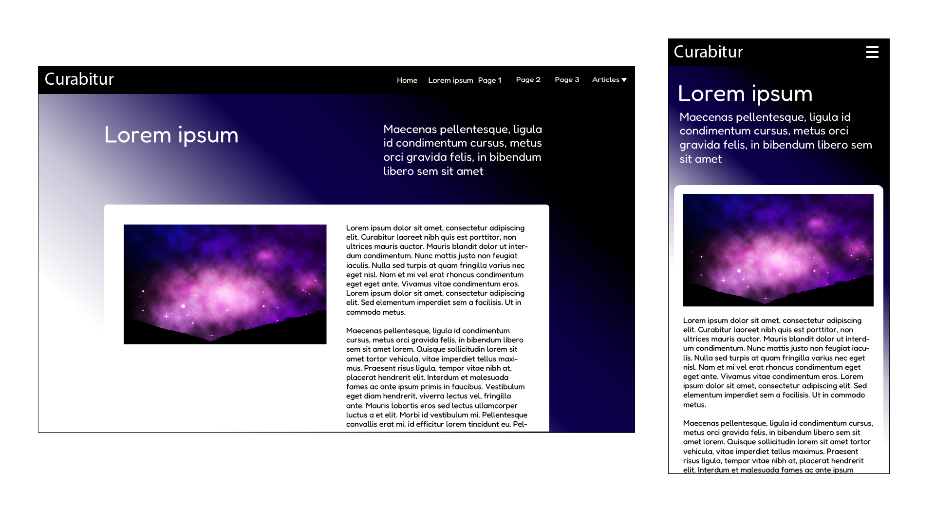
This is quite a simple test and design. It won’t win any awards, but should prove the UI library is a valid replacement for Bootstrap.
I've created a branch for each of the UI Libraries on the Next.js Huyton Web Services Repo so you can have a look at the code I've created for each. A link to each of the branches is available with each library. Below is the list of UI libraries I test, I look at:
NB. Tailwind might not belong on this list as it says it’s a ‘CSS Framework’ not a UI library, but as it could be a drop-in replacement for Bootstrap it may be a contender, so I’ve added it just to test its capabilities.
I have no real interest in a polished design at the moment, I am interested in time and difficulty. Let’s dig in.
MUI
Install
npm install @mui/material @emotion/react @emotion/styled
npm install @fontsource/jost
npm install @mui/icons-material
Installation is simple enough.
Colours
If you have 1 colour for your design, then there is a great colour tool to show complimentary colour and some other types. This will help build the colour pallet for the app.
Font
Fonts are installed the usual way using Next Google fonts import then adding to the theme. This is all done in the theme.js file:
import { Fredoka } from 'next/font/google';
const fredoka = Fredoka({
    weight: ['300', '400', '500', '700'],
    subsets: ['latin'],
    display: 'swap',
});
const theme = createTheme({
    typography: {
        fontFamily: fredoka.style.fontFamily,
    },
});
Image
Main image breaks out of the main container, fixed with an imageFix class in the global css.
.imageFix{
    max-width: 100%;
    height: auto;
    object-fit: cover;
}
Layout
I changed the CSS for the main container and body to set the colours. It worked as expected, so we can override styles as we need. This is great, allowing shadow and round corners or footer at the bottom.
Needed to force the scrollbar to stop the bounce on pages that are longer with and had to force the body to 100% height to stop the background colour finishing in a strange place:
html, body{
    min-height: 100vh;
}
body{
    overflow-y: scroll;
}
Main menu
Creating the main menu is not trivial and requires to slowly build up the menu from an App Bar and a menu. There is no mobile version, this must be built too.
Summary
MUI has some great components and is set up to work with React, however, there is a lot of work to get a page looking well designed. It does use import for each part, so nothing is added to the app without manually adding. This is great for keeping the app small. Code uses either JS or TS in the docs which is very useful.
MUI is simple to use, but took a little longer for the main menu simply because there is no good version in the docs.
MUI works with the IDE out of the box, no installing extras.
Mantine
Install
npm install @mantine/core @mantine/hooks
npm install --save-dev postcss postcss-preset-mantine postcss-simple-vars
Install was very easy.
Colours
There is a Mantine Colour Generator for default colours which is useful.
I did not try this but is should setup the colours for all components.
Font
Installing the font uses the normal Google font method, then add it to the theme:
import { Fredoka } from 'next/font/google';
const theme = createTheme({
    fontFamily: fredoka.style.fontFamily
});
Image
Changing the image import from “next/image” to “@mantine /core” gives us some options and we don’t need to use the imagefix CSS using this.
<Image
   src={content.main_image.url}
   alt={content.main_image.alt}
   fit="contain"
/>
Although removing the image width and height was a little strange and might need looking at.
Layout
Looking for layout and main containers is difficult to find, but it’s under Mantine Core and layout. This is not as good as some responsive layout and only supports up-to about 1000px resolution, anything lager doesn’t really count so this would need changing for larger monitors.
I needed to force the scrollbar to stop the bounce on pages that are longer with and had to force the body to 100% height to stop the background colour finishing in a strange place, but I had to do this for all libraries:
html, body{
    min-height: 100vh;
}
body{
    overflow-y: scroll;
}
The grid system seems simple enough and works well.
Main Menu
Adding the main menu was simple, but it does not create a mobile version as standard, this would need to be done manually.
Summary
This is a great piece of kit with lots of components, but there are issues working with the IDE causing errors. The documentation uses only TS without a JS version which will be an issue. IDE needs some installation plugins (if they exist) and newer code from Mantine is not supported correctly yet (if ever).
Using Mantine needs many code changes from the documentation to get a working version of examples.
Bootstrap
Install
Installing Bootstrap is not a simple matter
npm i bootstrap@5.3.3
npm i sass
Create a Bootstrap component and add the code:
"use client";
import { useEffect } from "react";
export default function Bootstrap()
{
    useEffect(()=>{
       import("bootstrap/dist/js/bootstrap.esm");
    },[]);
}
Import the above component into _app.js.
Rename globals.css to globals.scss and import the SCSS below into the file:
@import "../node_modules/bootstrap/scss/bootstrap";Because everything is added to the bundle we can remove unused styles with PurgeCSS. A useful blog post Removing unused CSS with PurgeCSS gives more information, but to get it to work we install with:
npm install --save-dev @fullhuman/postcss-purgecss
npm install postcss-flexbugs-fixes postcss-preset-env
Create the postcss.config.js file in the root of your app and add:
module.exports = {
   "plugins": [
       "postcss-flexbugs-fixes",
        [
           "postcss-preset-env",
            {
               "autoprefixer": {
                   "flexbox": "no-2009"
                },
               "stage": 3,
               "features": {
                   "custom-properties": false
                }
            }
        ],
        [
           '@fullhuman/postcss-purgecss',
            {
               content: [
                   './pages/**/*.{js,jsx,ts,tsx}',
                   './components/**/*.{js,jsx,ts,tsx}'
                ],
               defaultExtractor: content => content.match(/[\w-/:]+(?<!:)/g) || [],
               skippedContentGlobs: ['./node_modules/prismjs/**'], // Fails :(
               safelist: {
                   standard: [
                       "html",
                       "body",
                       "figcaption",
                       "references",
                       "thankYou",
                       "w-25",
                       "grecaptcha-badge",
                       "aside",
                       "modelBack"
                    ],
                   deep: [/mx/],
                   greedy: [
                       /img/,
                       /mx/,
                       /block/,
                       /message/,
                       /PhotoView/,
                       /gifcontrol/,
                       /jsgif/,
                       /pre/,
                       /code/,
                       /numbers/,
                       /print/,
                       /token/,
                       /float/,
                       /col/,
                    ]
                }
            }
        ],
    ]
}
Installation is not trivial and as classes are used we need to add them to the safe list or they are stripped out.
Colours
There is no override app for the colours, so any colour must be added manually.
Font
We install the font in the usual way from Google, but we also add the font to <main>:
import { Fredoka } from 'next/font/google';
const fredoka = Fredoka({
    weight: '300', // 700 for bold
    subsets: ['latin'],
});
<main className={fredoka.className}>
</main>
Image
Added the imageFix CSS to the image to stop it breaking out of the container.
Layout
Layout is achieved with divs and classes. Very simple.
Main Menu
Main menu is quite simple it’s just the NavBar and once configured it has the mobile version built-in with no duplication. We simply override the colours.
Summary
Bootstrap is great for layout and quickly adding columns and rows, but it soon becomes messy with the CSS overrides. We can add the full library, but not import components as we need them, so there is a large file size. To make the CSS/JS smaller we need to install and configure PurgeCSS. Installation takes a long time and can be tricky. There are no components for React as Bootstrap is not built for it.
For a brand new project I would try to stay away from Bootstrap.
React Bootstrap
Install
npm i react-bootstrap bootstrap
npm i scss
Rename globals.css to globals.scss and add the import into the file:
@import '~bootstrap/scss/bootstrap';Colours
To use dark mode for the whole app we need to create a Next.js _document.js page and add data-bs-theme="dark" to the html element. Very simple.
Font
We install the font in the usual way from Google and add the font to <main>:
import { Fredoka } from 'next/font/google';
const fredoka = Fredoka({
    weight: '300', // 700 for bold
    subsets: ['latin'],
});
<main className={fredoka.className}>
</main>
Image
We can use the import from react-bootstrap for the image instead of using the import from Next.js similar to Mantine. This gives us the option of using fluid and we don’t need the width and height.
//import Image from "next/image";
import Image from 'react-bootstrap/Image';
Layout
We add the layout using components and only import them as we need them. This is a much neater option over the full import on Bootstrap then using multiple classes. We can use most of the classes from Bootstrap for example rounded-top on the container.
Main Menu
Using the Navbar makes creating the main menu simple. The main menu also comes with a mobile version without duplication.
There are 2 versions of the mobile, one the usual burger menu that slides down an also a second type called Offcanvas that slides from the side. I went for the one that slides down and didn't try Offcanvas.
Summary
Simple setup, simple classes, gets out of the way when needed and good looking. Takes all the best parts of Bootstrap and makes it into components you import as needed. Oh, and on npm run dev this felt as fast as Bootstrap which feels the most performant of all the libraries here.
Chakra
Install
npm i @chakra-ui/react @emotion/react @emotion/styled framer-motionAfter install import the Chakra and add the component around the app
import { ChakraProvider } from '@chakra-ui/react'
function App() {
  return (
   <ChakraProvider>
     <TheRestOfYourApplication />
   </ChakraProvider>
  )
}
Simple install.
Colours
First we need to create a theme.js, then a _document.js both in the pages/ folder. then we need to add quite a bit of code to get the dark theme working.
// pages/theme.js
import { extendTheme } from '@chakra-ui/react'
const config = {
    initialColorMode: 'dark',
   useSystemColorMode: false,
}
const theme = extendTheme({ config });
export default theme;
// pages/_document.js
import { ColorModeScript } from '@chakra-ui/react'
import NextDocument, { Html, Head, Main, NextScript } from 'next/document'
import theme from './theme'
export default class Document extends NextDocument {
    render() {
        return (
            <Html lang='en'>
               <Head />
               <body>
                   <ColorModeScript initialColorMode={theme.config.initialColorMode} />
                   <Main />
                   <NextScript />
               </body>
           </Html>
        )
    }
}
To get this to work I needed to remove the local storage data under Application → Clear site data.
Font
We install the font in the usual way from Google, but we also add the font to <main>:
import { Fredoka } from 'next/font/google';
const fredoka = Fredoka({
    weight: '300', // 700 for bold
    subsets: ['latin'],
});
<main className={fredoka.className}>
</main>Layout
Everything is has to be re-thought as all html tags are reset e.g. <h1> is <Text fontSize='6xl' as='h1'> and <h2> is <Text fontSize='5xl' as='h2'>.This would not work with a CMS WYSIWYG as a CMS relies on html tags.
Main Menu
I didn’t get the chance to look at this in the time. It would need building from scratch as there is no Main Menu component we can simply use.
Summary
Does have a built in check for the Operating System colour scheme if you provide dark and light designs.
The Documentation is a bit random between JS and TS and sometimes we are not told if the code is TS or JS.
Chakra has a full reset of all styles e.g. <p>, <h1> and <h4> are all set to font-size: 16px.
Unfortunately, half a day is nowhere near enough time to look at this UI library. I could not see a way to add in the basic layout or the main menu without building from scratch. There are 3rd parties that can help with this (e.g. Chakra UI Templates ) but nothing that had a simple, responsive layout to use.
Personally, I like the idea of Chakra, but there is too much to do here compared to other UI libraries.
Tailwind
Install
npm install -D tailwindcss postcss autoprefixer
npx tailwindcss init -p
Update the config:
// tailwind.config.js
/** @type {import('tailwindcss').Config} */
module.exports = {
  content: [
   "./app/**/*.{js,ts,jsx,tsx,mdx}",
   "./pages/**/*.{js,ts,jsx,tsx,mdx}",
   "./components/**/*.{js,ts,jsx,tsx,mdx}",
    // Or if using `src` directory:
   "./src/**/*.{js,ts,jsx,tsx,mdx}",
  ],
  theme: {
    extend: {},
  },
  plugins: [],
}
Add the global css
// globals.css
@tailwind base;
@tailwind components;
@tailwind utilities;
Simple setup using the Tailwind guide.
Tailwind works with PHPStorm out of the box, so no changes to the IDE necessary.
To add back some of the html tag styles allowing us to use a CMS WYSIWYG we install a plugin:
npm install @tailwindcss/typographyAdd the plugin to config:
// tailwind.config.js
/** @type {import('tailwindcss').Config} */
module.exports = {
  theme: {
    // ...
  },
  plugins: [
   require('@tailwindcss/typography'),
    // ...
  ],
}
Now we can use the class on our CMS content e.g.
<div className="prose" dangerouslySetInnerHTML={{ __html: content.body }} />Colours
No matter what I did I could not get the Tailwind to switch to dark mode without creating a switch. For the design I need to start on dark mode and work from there. I found an answer on stackoverflow - force tailwind dark mode, forcing dark on the light the media query which works.
@media (prefers-color-scheme: light) {
    html {
        color-scheme: dark;
    }
}
Next create a pages/_document.js and add the class dark to the html tag:
import { Html, Head, Main, NextScript } from 'next/document'
export default function Document() {
    return (
        <Html lang="en" className="dark">
            <Head />
           <body>
            <Main />
           <NextScript />
           </body>
        </Html>
    )
}
Font
Font is added in the usual way with Google fonts:
import { Fredoka } from 'next/font/google';
const fredoka = Fredoka({
    weight: '300', // 700 for bold
    subsets: ['latin'],
});
<main className={fredoka.className}>
</main>
Image
Our image works out of the box and resizes correctly without any fixes, we simply add it to a container. However, I did add the class break-after-column to keep the image on its own column.
Layout
Layout is created by adding classes into containers until we have the correct look. For example my main container needed to be responsive, white and rounded at the top:
<div className="container mx-auto bg-white p-4 rounded-t-md">Tailwind works well and as the app gets larger our CSS won’t grow huge and we won’t have lot’s of overriding CSS classes and styles. It does have a LOT of classes in each tag though making the html rather ugly.
Main Menu
Some of the components are paid for on the Tailwind components website but some are free. There is a free main menu which works well and with a little time and effort I could probably get any type of menu working with it, however, there is duplication between the desktop and mobile versions
Summary
Tailwind strips all styles, so won’t work with a CMS WYSIWYG i.e. if a user add <h2> to a heading there will be no difference to a <p>. If we add in a plugin called Typography we can use a class called prose that will allow us to use a CMS WYSIWYG again.
Some of the good components are paid for, which is something to think about when using Tailwind.
Shadcn
Install
To install this we need Tailwind, see the Tailwind section for this. Once Tailwind is working correctly add shadcn with:
npx shadcn@latest init -dThis is a setup script and the -d add the default answers so you don't get asked a bunch of questions we don't know the answers too.
We now have a components.json file with some config and a /lib/utils.js, we’ll need to add these to the git repo too. There are also a lot of interesting styles added to the globals.css.
Site Setup
For the Colours, Font, Image and Layout, we use Tailwind.
Main Menu
Shadcn does not have a “Main Menu” component, but does have Navigation bar and MenuBar components that would allow a build of a main menu. However, the Tailwind version works out of the box so I’ve not looked at building a brand new one using parts from these components.
Summary
Shadcn is a list of components that use Tailwind and they are similar to the paid versions offered by Tailwind. Starting with Tailwind to create the layout then using Tailwind components, but if we get stuck, we can always add shadcn later.
Finishing up
Chakra is not the correct library for most (if not all) my projects because I use a CMS and resetting the html element styles is a big no. I also tend to use JS, not TS, so the docs require careful changes to any code.
Shadcn is also out as it relies on Tailwind which has all the building blocks I need to create a well-designed layout. However, Tailwind does reset the html element styles, which I’m not so sure about, it feels like I removed the html tag styles then added them back with a plugin. On the one hand I know all browsers and devices will have the same styles, on the other, this is a duplication and makes the file size lager, so I'd probably stay away from Tailwind too.
This leaves Mantine, React Bootstrap or MUI.
Mantine has a good selection of full components and styles to create a great UI. It is also very pretty. The only issues are Mantine is overused (we see it all over the internet) and the documentation is in TS not JS. I would be happy to use it if a team wanted to use it because they had experience with it.
Bootstrap/React has everything I would need; it feels responsive and uses less code for the main menu than any of the other UI libraries. There are many Themes that can be purchased, lots of components that can be used to build up a great UI and there are also Themes to purchase.
Lastly, there is MUI. This has everything needed to build a UI, it allows us to build complex components, use components already built or purchase and use free themes. The MUI website has the most information of all these libraries and feels the most polished.
Out of all of these I will choose Bootstrap/React or MUI for all new projects. For the more app based I would use MUI, but for more web based I would go with Bootstrap/React.
If you have any experience with these libraries or you have anything to add please comment and let us know. If you are looking for somone to build an app or site with one of these contact us and have a chat.